
How the best AI-native PMM and Brand operators are replacing $300k brand audits in hours
A private market intelligence app, built over a weekend for the price of dinner, that refreshes whenever you want. Full prompt included.

I'm nearly 3 months into running StackedGTM full time. I've booked over 3x my annual Webflow salary in that time, and Lovable shows up in over half my projects. Most of that comes down to one practice. When I kick off a project, the first thing I build is a private market intelligence app. It gives me a real-time read on how the market actually talks about the company and every competitor, the positioning gaps nobody has claimed yet, and which competitors are stumbling right now. I call it Vibe Market Research. It's become how the best AI-native PMM and Brand operators I know do the upstream research that used to define the function. I've handed the prompt to a bunch of them, and they're using it to set their roadmap.
Brand audits, competitive narrative studies, customer sentiment refreshes, the “how is the market actually framing us” project, the messaging validation work that used to precede every launch. Every one of those was historically either a $100-300k engagement with an outside research firm, or a six-to-eight-week internal sprint that produced a static deck most of the org never opened twice. Both took months, and both were already stale the day they shipped.
Now you build a private market intelligence app yourself, in a weekend, for around thirty dollars in API spend. The app scrapes every public mention of your company and your competitors across Reddit, G2, Capterra, TrustRadius, podcast transcripts, LinkedIn, Hacker News, comparison content, and operator newsletters. It clusters what it pulls into a structured narrative: positioning gaps, messaging opportunities, competitive scoring across the dimensions you actually care about, sentiment heatmaps by theme, and the verbatim quotes that hold up when someone pushes back on a finding. You ship it as a private, password-gated URL the team can scroll through and re-run on demand.
The tool is Lovable, the artifact is yours, and the work that used to take months and burn cash now ships in a weekend for about the price of dinner.
I built one for Clay (the GTM data orchestration platform) as the worked example for this piece. I don’t work with Clay. I picked them because they had the right conditions for a useful teardown: loud sentiment in both directions, a crowded and rapidly evolving competitive set, and an unusually deep public data trail across Reddit, G2, operator podcasts, and LinkedIn ambient commentary. If Vibe Market Research works for Clay, it works for anything.
You can play with the live Clay Narrative OS at before reading the rest. What follows is a walkthrough of the artifact, the full prompt I used to build it, and instructions for adapting that prompt to your own company by the end of this weekend.
How the practice actually works
The signal was never the bottleneck. It’s been sitting in plain sight for years on Reddit, on G2 and TrustRadius, in every podcast transcript your buyers actually listen to. The bottleneck has always been synthesis, the analyst hours required to pull thousands of public mentions into a coherent narrative a CMO can act on. That layer is what a build in Lovable now eats.
If anything, the work matters more than it used to because category lines are being redrawn faster than any annual planning cycle can track. The difference is that one person with the right prompt can now produce something better than what a research firm would have shipped, in a weekend for thirty dollars instead of two months for sixty thousand.
Brand and PMM teams get something specific out of this practice that other functions don’t.
First, the deliverable is alive. It’s a URL, not a PDF, and you re-run the synthesis whenever you want. The narrative refreshes with the market because there is no static deck to update.
Second, the output is grounded in verbatim evidence. Every claim sits next to a sentence someone actually wrote on a public forum, with attribution and a source link. That changes how the conversation goes. You stop arguing positioning from gut, and senior stakeholders engage differently when the evidence is on the screen instead of in your head.
Third, you own the artifact. You’re not renting it from a firm, waiting on a contract, or hoping the renewal gets approved next year. It belongs to your team forever, and it gets sharper every time you run it.
The Clay Narrative OS
I picked Clay as the worked example because of the public data depth I mentioned above, and because it’s a company most PMM and Brand operators reading this will already have an opinion on. Easier to test the artifact against your own gut when the subject is familiar.
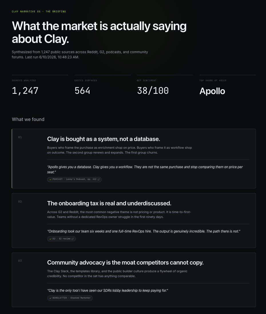
The Clay Narrative OS scraped 1,247 public sources, pulled 564 verbatim quotes, scored eight competitors across five dimensions, mapped sentiment to nine themes, and surfaced three positioning gaps that were not on my radar going into the build. Total build time was about 3 hours of actual work spread across a weekend, with around thirty dollars in API spend.
The OS has five screens, and each one does a specific job in the analysis. The structure matters as much as the data, because the screens compound. The Briefing forces the synthesis to commit to a thesis. The Market Moment grounds that thesis in category context. The Competitive Landscape shows where the subject sits relative to alternatives. The Customer Voice provides the evidence layer. The Strategic Implications convert all of it into the moves you can actually run on Monday morning.
The Briefing
What this section is for: to force the synthesis to commit to three claims the rest of the OS has to support. If your research doesn’t end in a clear point of view, you don’t have research, you have a literature review.
The Briefing opens with three headline findings the synthesis surfaced. These were not findings I went looking for. I wrote the prompt, ran the synthesis, and read what came out. The OS pulled these directly from the clustered evidence:
Clay is bought as a system, not a database. Buyers frame the purchase as enrichment-plus-orchestration. Apollo is bought as a database. That distinction is the entire competitive wedge.
The onboarding tax is real and underdiscussed. It’s the single most consistent negative theme in the dataset. Median time-to-full-ROI mentioned in the reviews is around six weeks.
Community advocacy is the moat competitors cannot copy. The Clay Slack, the template library, and the certification program get referenced in customer language more often than the product itself.
The 4-up stat row at the top (sources analyzed, quotes surfaced, net sentiment score, top competitor by share of voice) gives the reader a one-glance sense of the dataset’s depth before they read a single finding. The “Run new synthesis” button at the bottom is the architectural point of the whole OS, because the artifact is alive instead of frozen.
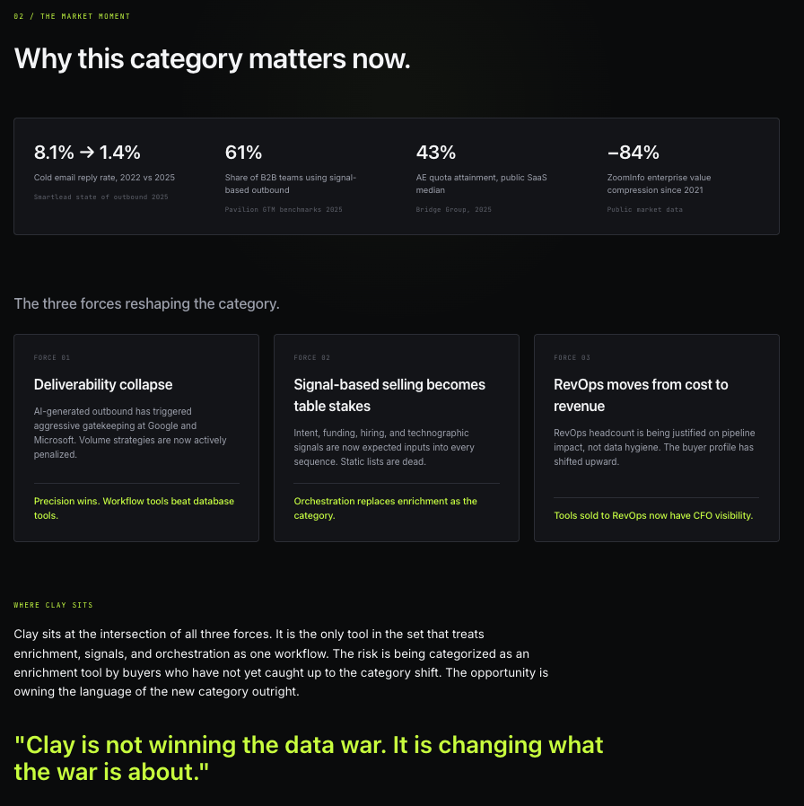
The Market Moment
What this section is for: to set the category context so the subject’s positioning gets judged against the right backdrop. Most positioning work fails because it analyzes the company in isolation. The Market Moment fixes that by forcing the analysis to name the forces reshaping the category before it touches the company itself.
Four sourced stats on the GTM data category establish that the ground is moving. Three forces reshaping the category (deliverability collapse, signal-based selling becoming table stakes, RevOps shifting from cost center to revenue lever) name the actual movement underneath the noise. The synthesized pull-quote that closes the screen is “Clay is not winning the data war. It is changing what the war is about.” That sentence did not come from me. The clustering surfaced it, and it does more work in one line than most positioning decks do in twenty pages.
The Competitive Landscape
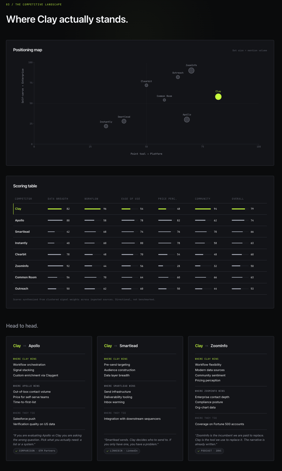
What this section is for: to remove the option of arguing positioning in a vacuum. Buyers compare, boards compare, investors compare. The Competitive Landscape forces the analysis to do the same in three different formats so no one in the room can claim the comparison wasn’t structured.
The 2D positioning map plots Clay against Apollo, Smartlead, Instantly, Clearbit, ZoomInfo, Common Room, Outreach, and Salesloft. Two axes (point tool to platform, self-serve to enterprise) define the category space, and the dots are sized by mention volume. The scoring table runs across five dimensions (data breadth, workflow power, ease of use, price perception, community advocacy) and uses synthesized signal weights from the dataset. The three head-to-head comparison cards (Clay vs Apollo, Clay vs Smartlead, Clay vs ZoomInfo) hold the verbatim quotes that justify each claim, so a skeptical reader can drop into the evidence from the map and the table on demand.
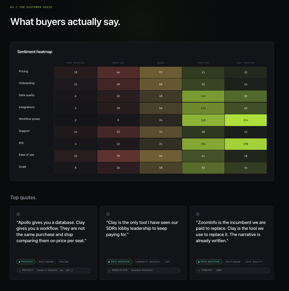
The Customer Voice
What this section is for: to put the evidence layer on the screen. This is what turns the OS from “interesting deck” into “irrefutable artifact.” Every claim earlier in the OS is anchored to quotes that live here, with attribution and source links. If a stakeholder challenges a finding, you scroll here. Most board rooms have never seen a positioning argument that holds up under that pressure.
The sentiment heatmap maps nine themes (pricing, onboarding, data quality, integrations, workflow power, support, ROI, ease of use, scale) against five sentiment buckets, with every cell sourced. Twelve verbatim quotes carousel across the top with full attribution. Below them sit nine theme deep-dives, each with three example quotes and a sentiment ratio bar showing the positive-to-negative split. The reason the heatmap is the most screenshot-worthy artifact of the entire OS is that it compresses thousands of public mentions into a single visual a CMO can scan in ten seconds.
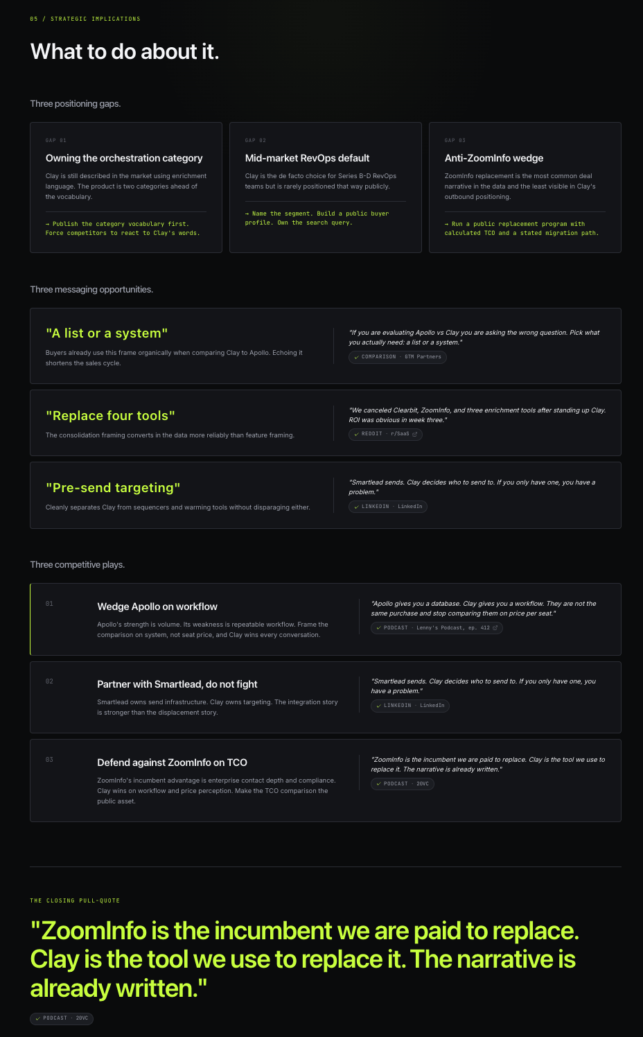
The Strategic Implications
What this section is for: to convert analysis into moves. Without this screen the OS is interesting but inert. With it, you walk out of the read with a brief for what your team should do next quarter.
Three positioning gaps name where the subject is under-credited in the market relative to what the data shows. Three messaging opportunities pull verbatim phrases buyers already use that the subject isn’t echoing back. Three competitive plays prescribe specific moves against the three main competitors, each with a two-sentence rationale and a supporting quote. The closing pull-quote is “ZoomInfo is the incumbent we are paid to replace. Clay is the tool we use to replace it. The narrative is already written.” Someone in the dataset said something close to that, and the clustering pulled it through as the closing argument. That single line is the entire competitive thesis, surfaced not written.
The architecture under the design
Perplexity scrapes the sources in parallel, one call per source type, returning verbatim quotes with attribution. Claude synthesizes everything into a JSON payload that follows a schema defined in the prompt. Supabase persists the results and runs the API calls through edge functions so the keys never touch the client. End-to-end run takes under two minutes once it’s wired up.
I’m not a developer and haven’t written code in over a decade. Lovable scaffolded the entire app from one initial prompt and a few rounds of iteration after that.
Where this earns its keep
This isn’t a one-time party trick. It’s a new tool slot in how Brand and PMM teams operate, and here’s where it pays for itself in the first week.
Board decks. When the board asks where the moat is, you don’t say “community advocacy.” You show them the heatmap, quote the buyer who said it, and hand them the live URL. The conversation changes because the evidence is no longer abstract. Same dynamic for any board question about competitive position, pricing perception, category framing, or churn drivers. The room engages differently when the evidence is on the screen.
Internal presentations. Sales kickoffs, all-hands meetings, QBRs, leadership offsites. The artifact lands anywhere the company gathers and needs a shared view of the market. Project the top twelve verbatim quotes on the wall and the whole company starts speaking buyer language instead of internal language. I’ve watched CROs change how they open the next QBR after sitting with one of these for ten minutes. It reframes what the team thinks it’s actually selling.
Roadmaps. The onboarding tax finding the OS surfaced for Clay didn’t come from anyone’s gut. It came from forty reviews saying the same thing. Take a finding like that to product and the prioritization conversation changes shape in real time, because product can see the volume of the complaint instead of hearing it once secondhand from sales.
Interview prep. This is the one I’d quietly tell anyone going after a senior PMM or CMO role. I built a version of this OS for a CMO interview process I went through earlier this year at a B2B SaaS company. I walked into the final round with a synthesized narrative on the company, its competitors, and the exact language its buyers were using in the wild. The interviewers asked me how I built it, I told them, and I sent them the URL after the conversation. It was the most prepared I have ever been for a senior interview. I got the offer but ended up walking from it for unrelated reasons, but the artifact changed the conversation while I was in it.
Messaging tests. Before you ship new positioning, run the OS. Does the market already use the language you’re about to claim? If yes, you’re echoing back, which is what you want. If no, you have an uphill battle ahead of you, and you should know that before the campaign budget is committed.
Important: The displacement window
Most competitive displacement runs on stale inputs. The win/loss program reports once a quarter. The battlecard gets updated when someone remembers to update it. By the time the deck reflects a competitor’s weakness, the weakness is three months old and the competitor has had a full quarter to patch the narrative around it.
The OS collapses that delay to days. You re-run the synthesis on a schedule. When a competitor stumbles, the signal shows up in the heatmap before it shows up anywhere else you’d look. A price increase, a botched release, a support backlog, a security incident, a founder departure the forums are picking apart. Each of those opens a window where the competitor’s own customers are saying out loud, in public, why they’re unhappy and what they’d switch for. The window stays open for a few weeks and then it closes, because the competitor fixes the issue or the thread cools and the buyers move on.
Catching the window the week it opens is the entire game.
Here is the sequence I’d run. Re-run the synthesis weekly. Watch the negative cells in the heatmap for a competitor you’re targeting. When a cell spikes, drop into the quotes and confirm it holds across two runs, so you’re acting on a real shift and not one loud thread. Pull the verbatim phrases buyers are using. Then move on three fronts while the window is open. Hand sales the exact language so the talk track lands the day a prospect is already feeling the pain. Stand up a comparison page that mirrors the complaint back in the buyer’s words instead of your marketing’s words. Point outbound at the segment complaining loudest, timed near the competitor’s renewal window when switching cost is lowest.
Take ZoomInfo, since it’s the incumbent in the Clay set. The recurring complaint in the data is contract lock-in and price at renewal. That part is not a secret. What the OS gives you is the moment the complaint volume spikes, the phrases buyers use when it does, and the segments where it’s loudest right now. You’re not running a generic “switch from ZoomInfo” campaign that’s been live for a year. You’re running the play that matches what their customers are upset about this week, in the words they’re using this week.
The competitor cannot respond at your speed. Their win/loss program still reports quarterly. You’re on a weekly clock against an opponent on a quarterly one. That gap is the displacement.
The honest limits
A few things to know before you put one of these in front of an executive.
It’s directional, not statistically valid. Public data has selection bias. Loud users post more than satisfied users, and churned customers leave louder reviews than active ones. You’re seeing a slice of the truth, not the whole truth, and you should say so when you present it.
You still need real customer conversations. The OS surfaces patterns. Conversations tell you what the patterns mean and which patterns matter most for the decision in front of you. The OS is upstream of the customer interview, not a replacement for it.
The competitive scoring is synthesized signal weights, not benchmarks. Treat the numbers as sentiment proxies. Don’t put a synthesized 84/100 in front of a board and call it a Gartner score.
Real-time means real noise. If you re-run the synthesis on a day when one negative thread is going viral, the sentiment heatmap will tilt with it. Run it weekly, not daily, and look at trend rather than a single snapshot.
Public data is not all data. Your CRM, your call recordings, your closed-lost notes, your renewal survey responses are all richer than anything on Reddit. Wiring those in is the next move and the architecture above supports it. That’s a follow-up post.
The point
The research firm just got Napsterized, and the eight-week internal sprint went with it. What replaced both is a one-person operating practice that costs almost nothing, ships in days, and refreshes whenever you want.
The work Brand and PMM exists to do hasn’t gotten easier. The cost and time required to do it well has collapsed. The teams that internalize this first will buy themselves two or three quarters of compounding advantage before their competitors notice the playbook changed. The rest will keep paying firms forty to a hundred thousand dollars for a PDF that goes stale before it ships.
Play with the Clay Narrative OS at if you haven’t already. The full prompt is below, versioning it for your own company is about an hour of editing, and the math is in your favor on every dimension that matters.
Build one this week. Send me what your OS surfaced about your category that you didn’t already know. I read every reply.
The full prompt I used
This is the part most posts about AI tools never give you. Here is the full prompt I pasted into Lovable as the first message to scaffold the Clay Narrative OS. It defines the design system, the data model, the five screens, the API integrations, the synthesis logic, the voice rules, and the lockdown. Adapt the four sections I’ll call out below the prompt and it becomes yours.
Build me a private, single-operator market intelligence app called Clay Narrative OS. It is a synthesized competitive and customer-sentiment narrative for Clay (clay.com, the GTM data orchestration and workflow automation platform), generated by analyzing thousands of public mentions across Reddit, G2, Capterra, podcast transcripts, LinkedIn, Hacker News, newsletters, and comparison content. This is an internal research artifact, not a marketing site. It must never be indexed by search engines and should sit behind a lightweight passcode gate.
THE FEELING I WANT
Premium operator dashboard. Dark, editorial, calm, expensive. The reference points are a Bloomberg terminal crossed with a modern research firm’s interior dashboard: near-black canvas, one confident electric chartreuse accent, sharp typographic hierarchy, lots of negative space, subtle depth, smooth motion. It should feel like a tool a CMO is proud to project on a boardroom screen. Avoid the default AI-generated look: no purple gradients, no generic rounded-everything cards, no emoji in the UI, no clip-art icons, no bubbly drop shadows. Specifically no Clay-style purple anywhere. This is our analysis of Clay, not Clay’s brand.
DESIGN SYSTEM (use these exact tokens)
Colors
- Canvas: #0A0B0D
- Surface 1: #131418
- Surface 2: #1B1D22
- Border: #2A2D34
- Text primary: #F4F5F7
- Text secondary: #9CA0AB
- Text tertiary: #5E626D
- Accent: #C8FF3D (electric chartreuse, use sparingly)
- Accent dim: #8DB52A
- Positive sentiment: #6BE3A0 (mint)
- Negative sentiment: #FF6F5E (coral)
- Neutral / mixed: #FFD45E (warm amber)
Typography
- Display: Space Grotesk, weights 500 / 600 / 700
- Body: Inter, weights 400 / 500 / 600
- Mono (numbers, citations, timestamps): JetBrains Mono, weights 400 / 500
- Type scale: 12, 14, 16, 18, 24, 32, 48, 64
Layout
- Max content width 1280px, centered
- 96px between top-level sections
- Cards have 1px solid border, no drop shadow, optional 2px accent rail on left for emphasis
- Radius: 6px on cards, 4px on inputs, 999px on pills
Motion
- All transitions 200ms cubic-bezier(0.2, 0.8, 0.2, 1)
- Fade-in-up on scroll via Framer Motion, 24px translate
- No bouncy spring animations
- Page transitions: 400ms cross-fade with slight slide
- Number counters animate up on scroll for stat blocks
No-go list
- No emoji in the UI
- No clip-art icons (Lucide outline icons only, 1.5 stroke)
- No drop shadows (use borders for depth)
- No purple or violet anywhere
- No gradients except one optional subtle radial behind the hero
- No fully rounded cards, no playful microinteractions
TECH STACK
- Vite + React + TypeScript
- Tailwind for utility styling
- Framer Motion for transitions
- Supabase for persistence and edge functions
- Lucide React for icons
- Recharts for data viz
API INTEGRATIONS
Prompt me for three API keys before any live scraping:
1. Perplexity API (primary intelligence workhorse)
2. Anthropic API (Claude for synthesis, model claude-sonnet-4-6)
3. Optional Firecrawl or Apify (only if direct scraping of G2 pages is required)
Every API call must be proxied through Supabase edge functions. Keys never appear in client code. If a call fails, surface a clean inline error inside the relevant card and do not break the page.
DATA SOURCES TO SCRAPE, IN PRIORITY ORDER
1. Reddit via Perplexity queries: r/sales, r/SaaSMarketing, r/marketing, r/SaaS, r/B2BSaaS, r/RevOps, r/coldemail, r/Entrepreneur, r/Startups
2. G2 reviews and comparison pages
3. Capterra and TrustRadius reviews
4. Podcast transcripts: 20VC, Lenny’s Podcast, GTMnow, Topline, SaaStr Podcast, RevOps Co-op, The Marketing Millennials
5. LinkedIn ambient public discussion (public posts and threads only, no private data)
6. Hacker News threads
7. Operator newsletters: Lenny’s Newsletter, Stacked Marketer, Demand Curve, Pavilion, GTM Partners
8. Comparison content (vs pages, alternative listicles, head-to-head reviews)
THE SUBJECT AND COMPETITIVE SET
Subject: Clay (clay.com). GTM data orchestration and workflow automation. Lets revenue teams enrich, dedupe, and orchestrate outbound across hundreds of data sources.
Competitors:
- Apollo.io (volume and coverage)
- Smartlead (outbound execution and deliverability)
- Instantly (deliverability and volume)
- Clearbit, now part of HubSpot (enrichment heritage)
- ZoomInfo (enterprise data incumbent)
- Common Room (community and signals)
- Outreach and Salesloft (sequencing platforms with enrichment bolted on)
- LeadMagic, Findymail, Datagma (point tools at the data layer)
DATA MODEL
type Source = {
id: string
type: ‘reddit’ | ‘g2’ | ‘capterra’ | ‘trustradius’ | ‘podcast’ | ‘linkedin’ | ‘hn’ | ‘newsletter’ | ‘comparison’
url: string
author: string | null
date: string
raw_text: string
retrieved_at: string
}
type Quote = {
id: string
source_id: string
text: string
sentiment: ‘very_negative’ | ‘negative’ | ‘mixed’ | ‘positive’ | ‘very_positive’
themes: string[]
competitor_mentioned: string | null
attribution: ‘verified’ | ‘synthesized’
}
type CompetitorScore = {
competitor: string
data_breadth: number
workflow_power: number
ease_of_use: number
price_perception: number
community_advocacy: number
overall: number
source_quote_ids: string[]
}
type Synthesis = {
id: string
run_at: string
source_count: number
quote_count: number
payload: object
}
BUILD THESE FIVE SCREENS, IN THIS ORDER
1. The Briefing (landing and command center)
Eyebrow at top: CLAY NARRATIVE OS in accent chartreuse, mono, 12px, uppercase. Below it, headline in Space Grotesk 600 at 64px: “What the market is actually saying about Clay.” Subhead at 18px in text-secondary: “Synthesized from [N] public sources across Reddit, G2, podcasts, and community forums. Last run [timestamp].”
Below the hero, a 4-up stat row in JetBrains Mono:
- Sources analyzed
- Quotes surfaced
- Net sentiment score (positive minus negative, out of 100)
- Top competitor by share of voice
Below the stat row, a “What we found” section with three large stacked cards. Each card carries a step number (01, 02, 03), a one-line claim in display 32px, a two-sentence elaboration, and one verbatim supporting quote with attribution chip. The first card carries an accent rail.
At the bottom, a primary button “Run new synthesis” and a secondary “View raw sources.” Show last run timestamp.
2. The Market Moment
Three modules:
- Why this category matters now: a 2x2 stat grid with sourced numbers about the category. Each stat carries a source citation in mono 12px.
- The three forces reshaping the category: three vertical cards in a row, each with a force name, two-sentence explanation, and one-line implication in accent color.
- Where the subject sits: a single paragraph synthesis with one pull-quote in accent color, large.
3. The Competitive Landscape
Three modules:
- Module A: A 2D scatter plot in Recharts. X axis: “Point tool” to “Platform.” Y axis: “Self-serve” to “Enterprise.” Each competitor is a dot sized by mention volume. The subject is highlighted in accent chartreuse with a label. On hover, show competitor name, total mentions, net sentiment.
- Module B: A scoring table with rows per competitor and columns for the five dimensions plus an overall. Use thin horizontal bars in chartreuse with the score number in mono. Subject row has an accent rail. Footnote: “Scores synthesized from clustered signal weights across ingested sources. Directional, not benchmarked.”
- Module C: Three side-by-side comparison cards: subject vs main competitor 1, subject vs main competitor 2, subject vs main competitor 3. Each card has two text logos, three rows (”Where subject wins,” “Where the competitor wins,” “Where they tie”), and one representative verbatim quote underneath.
4. The Customer Voice
Three modules:
- Sentiment heatmap: rows are themes (pricing, onboarding, data quality, integrations, workflow power, support, ROI, ease of use, scale), columns are sentiment buckets. Each cell shows a count in mono, shaded by intensity using a coral-to-chartreuse gradient. Cells are clickable, opening a modal with every quote in that cell.
- Top quotes carousel: a horizontally scrolling row of quote cards with quote in display 24px, attribution beneath (source type, author handle, date, link icon), sentiment pill, theme tags. 12 quotes default with “Show all” expand.
- Theme breakdown: vertical stack of theme sections. Each has theme name, one-line summary, three example verbatim quotes, and a horizontal sentiment ratio bar.
Every quote shows its source as a chip beneath it. Verified verbatim quotes get a small chartreuse checkmark. Synthesized quotes get a SYNTHESIZED FROM CLUSTERED LANGUAGE eyebrow tag and no checkmark. Never invent attributions.
5. Strategic Implications
- Three positioning gaps: each with a name, description, and one-line “what to do about it.”
- Three messaging opportunities: phrases buyers actually use, pulled verbatim from the dataset.
- Three competitive plays: specific moves against the three main competitors. Each with a two-sentence rationale and one supporting quote.
- One closing pull-quote: the single most clarifying verbatim quote from the dataset, displayed large in accent color, full-bleed.
At the very bottom: “Last synthesized [date]. Re-run from the Briefing screen.” in mono 12px.
THE SYNTHESIS ENGINE
When the user clicks “Run new synthesis,” a Supabase edge function runs the following pipeline.
Step 1: Parallel scraping via Perplexity. Fire eight Perplexity API calls in parallel using these query templates.
Reddit query: “Search Reddit for the 50 most recent and substantive discussions about [SUBJECT] (the [CATEGORY] tool). For each discussion, extract direct user quotes about pricing, complexity, data quality, integrations, ROI, and direct comparisons to [COMPETITOR LIST]. Return verbatim quotes with username, subreddit, and link. Do not paraphrase. Do not summarize. Return raw text only.”
G2 query: “Find the most recent and informative G2 reviews of [SUBJECT]. Extract 20 quotes covering both positive and negative experiences. Include reviewer role, company size, and review date. Return verbatim text only, no summary.”
Capterra / TrustRadius query: “Find recent Capterra and TrustRadius reviews of [SUBJECT]. Extract 15 most informative verbatim quotes with reviewer context.”
Podcast query: “Search podcast transcripts for substantive discussion of [SUBJECT] in the last 18 months. Prioritize [PODCAST LIST]. Extract direct operator commentary about how the product is used, who uses it, what works, what fails. Include episode title and approximate timestamp.”
LinkedIn query: “Search LinkedIn for public posts and public comment threads discussing [SUBJECT] in the last 6 months. Focus on posts by [TARGET AUDIENCE]. Extract verbatim quotes about deployment, ROI, and comparison to alternatives. Do not access private data.”
Hacker News query: “Search Hacker News for threads mentioning [SUBJECT]. Extract substantive technical and commercial commentary verbatim.”
Comparison content query: “Find comparison content (vs pages, alternative listicles, head-to-head reviews) covering [SUBJECT] against [COMPETITOR LIST]. Extract specific claims and data points verbatim, with source URL.”
Newsletter query: “Find operator newsletter mentions of [SUBJECT] in the last 12 months. Focus on [NEWSLETTER LIST]. Extract substantive analysis verbatim with publication and date.”
Store every returned source row in the sources table with its raw text.
Step 2: Synthesis via Claude. Pass all raw extracted text to Claude (claude-sonnet-4-6) in a single call with this synthesis prompt:
“You are a senior PMM analyst synthesizing public market intelligence about [SUBJECT]. You have been given raw extracted quotes and discussion threads from Reddit, G2, Capterra, podcasts, LinkedIn, Hacker News, comparison content, and operator newsletters. Synthesize this into a structured narrative analysis.
Return only JSON. No prose, no markdown fences. The JSON must follow this shape exactly:
{
briefing: { headline_findings: [3 cards with claim, elaboration, supporting_quote_id] },
market_moment: { category_stats: [4 stats with source], forces: [3 forces], position_paragraph: string, position_pullquote: string },
competitive: { scores: [CompetitorScore array], positioning_map: [...], head_to_head: { subject_vs_competitor1, subject_vs_competitor2, subject_vs_competitor3 } },
customer_voice: { heatmap: { themes, sentiments, cells }, top_quotes: [12 verbatim], themes: [9 themes] },
strategic: { positioning_gaps: [3], messaging_opportunities: [3], competitive_plays: [3], closing_quote_id: string }
}
Voice rules: No em dashes anywhere. Short declarative sentences. Operator-to-operator tone. No consulting jargon (no leverage, unlock, paradigm, best-in-class, thought leader, synergy, robust). No marketing words (no revolutionary, game-changing, transformative). Proof before explanation. Every numeric claim needs a source. Every quote shown must be verbatim with attribution. If you must synthesize a representative quote, mark its attribution as ‘synthesized’ rather than ‘verified.’
Be honest. If the subject has clear weaknesses, name them. If competitors have clear advantages, name them. This is for an operator making positioning decisions.”
Step 3: Persist the synthesis JSON to the synthesis table with a timestamp. The UI always reads from the most recent synthesis row.
VOICE AND COPY RULES
These apply to every string in the UI:
- No em dashes anywhere
- Short declarative sentences
- Banned words: leverage, unlock, paradigm, holistic, best-in-class, world-class, thought leader, ecosystem, synergy, robust, revolutionary, game-changing, transformative, cutting-edge, next-generation
- No emoji
- Proof before explanation
- Use numbers when available
- “Synthesized from clustered language” label on non-verbatim content
LOCKDOWN
- robots.txt with Disallow: / for every user agent
- noindex, nofollow meta tags on every page
- No social meta tags
- Passcode gate on entry, default passcode “narrative-os-2026,” validation through a Supabase edge function so the passcode is never in client code
- All API calls proxied through Supabase edge functions, keys never client-side
- No public share functionality
BUILD ORDER
1. Scaffold the five screens with placeholder synthesis JSON so design is locked first
2. Build the passcode gate and lockdown
3. Build the Supabase edge function for Perplexity scraping
4. Build the Supabase edge function for Claude synthesis
5. Wire the “Run new synthesis” button to the pipeline
6. Persist synthesis runs in Supabase with timestamps
7. Polish motion, micro-typography, and the heatmap last
Ask me for the three API keys when you need them. Confirm the Supabase project setup before any live scraping. Build the design and empty state first, then the data layer. Make it beautiful before it works.
How to version this for your own company
The prompt is structured so adapting it is a find-and-replace job, not a rewrite. Four sections need to change.
The subject is the obvious one. Replace every reference to “Clay” or “Clay (clay.com)” or “Clay Narrative OS” with your company name and URL. The naming convention I use is [Company] Narrative OS, but you can call it whatever you want.
The competitive set is the second swap. The prompt lists eight competitors specific to the GTM data category. Replace them with the seven or eight competitors that actually matter in your category. Keep the list to seven or eight, because fewer makes the positioning map look empty and more makes it unreadable. Order matters too. Put your two or three most important head-to-head competitors first, because those drive the comparison cards on the Competitive Landscape screen.
The data sources are the third swap. The Reddit subreddit list is GTM-tilted right now. If you’re in a different category, replace those with the subreddits where your buyers actually hang out. Same goes for podcasts and newsletters. If you sell to engineers, the relevant properties are The Changelog and Software Engineering Daily, not Lenny’s or 20VC. Pick the seven or eight your buyers actually consume.
The visual identity is the fourth swap. I used electric chartreuse for the Clay OS because I didn’t want it to look like Clay’s brand. If you’re building one of these for your own company instead of as outside analysis, you might want it to feel on-brand. Swap the accent color, the typography stack, or both. Keep the dark canvas though, because it reads as serious and analytical, and it makes the heatmap pop.
Once those four swaps are done, paste it into Lovable as the first message. The first version will be 80% of the way there. You’ll iterate from there with two or three follow-up prompts, mostly to fix things you only notice after the data actually scrapes.